INTRODUCTION
For this design test, I was challenged with completing three out of the five goals provided.
- 1. Design a new item card
- 2. Design a new vendor
- 3. Re-map the controller layout
- 4. Design a new movement mechanic
- 5. Improve on an existing Borderlands UX
Goals 1 and 2 were required, and I chose to tackle goal 4.
OUTLINE OF DESIGN TEST
GOAL 1
My First Gun Item Card
Simplifying the very, very complex
For the theming of my design, I took inspiration from a few keywords used in the test document.
Nanochip
Energy Reservoir
Digital
I then combined that with existing themes and mechanics from existing Borderlands titles.
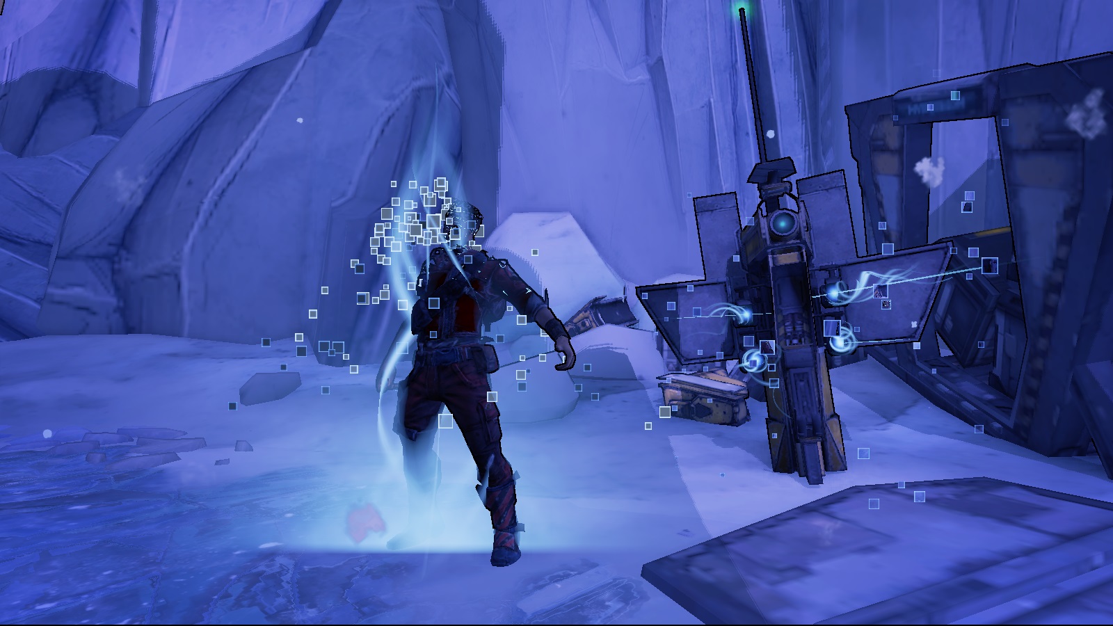
The New-U Stations
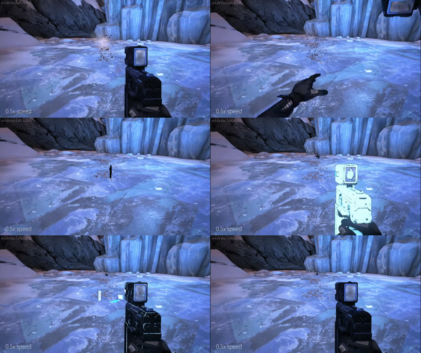
Digitally respawning weapons

ECHO devices
Then finally, I took a little inspiration from what was already being done.

God of War
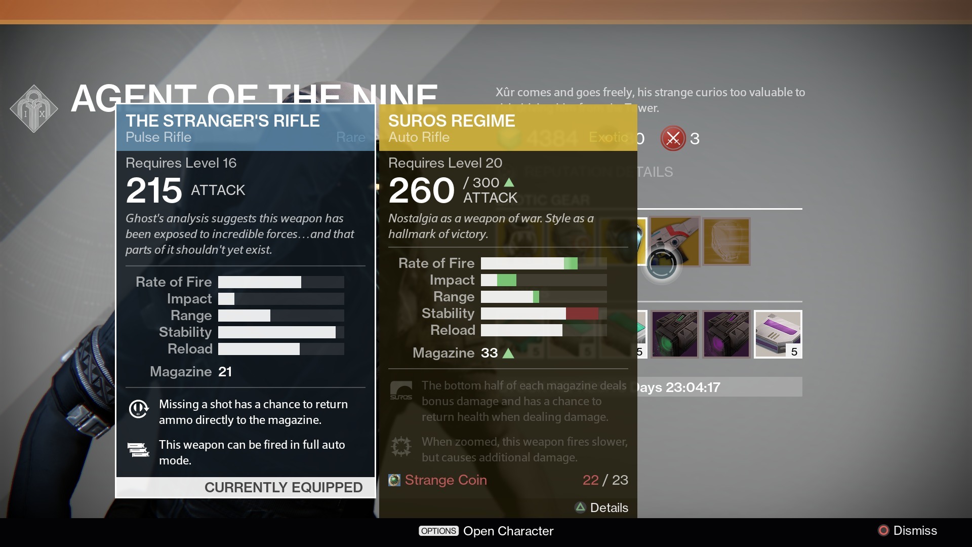
Destiny II
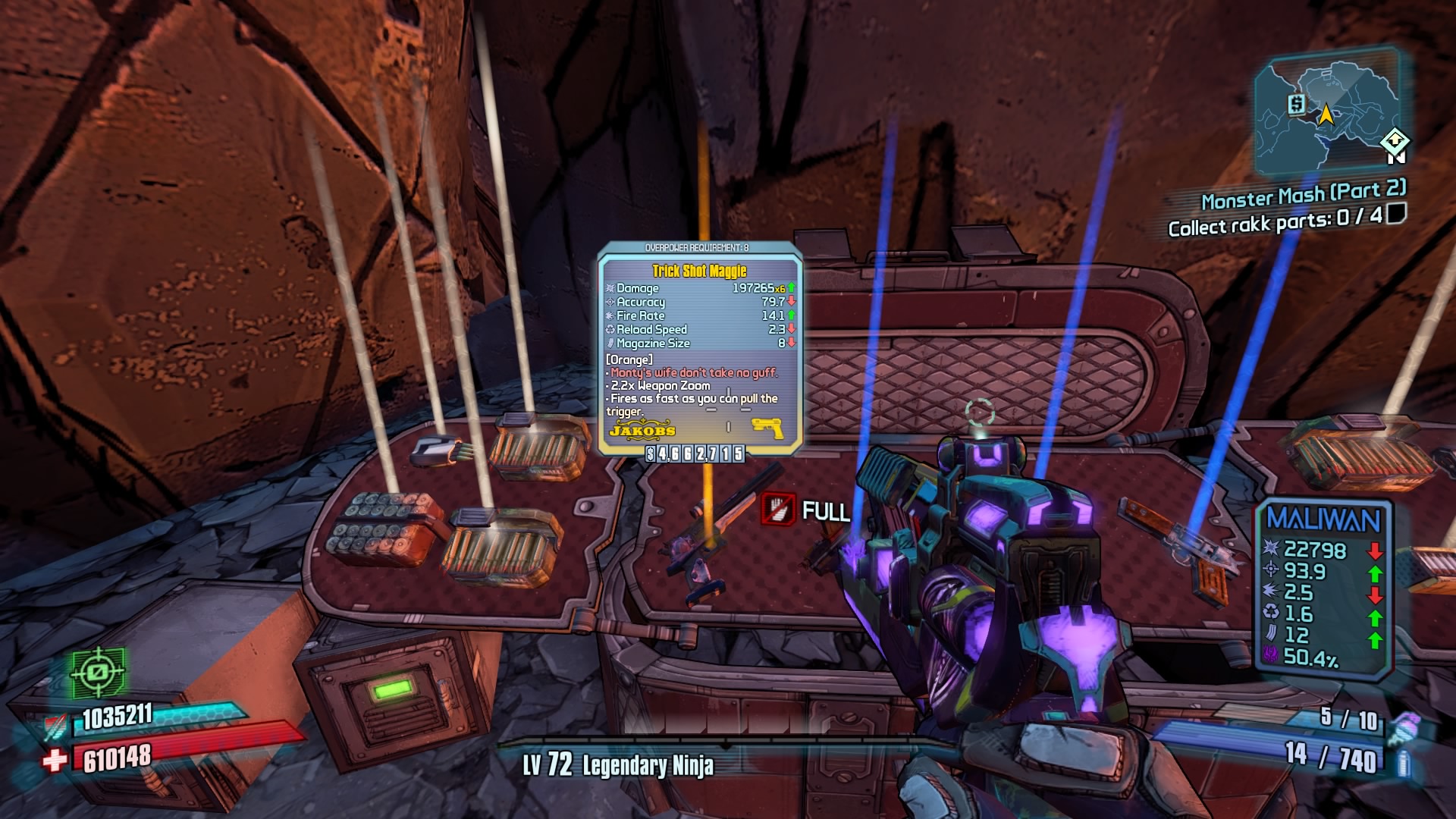
Borderlands
The result was an expansion of the digital laws already presented in Borderlands.
DESIGN
A Literal Memory Card
A digitally-printed play on words.
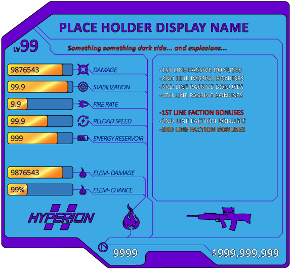
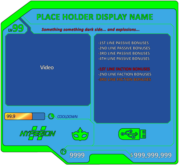
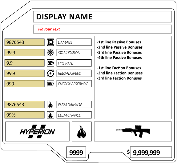
Technology is highly advanced in the reality of the Borderlands games, an example being the New-U Stations. When a player dies, they respawn via digital reconstruction of their former body. So, if a New-U Stations can digitally reconstruct player characters, why can't we digitally construct other objects in Borderlands?
For the item cards, I chose to revolve around the idea of a memory card.
Each item (gun, shield, grenade pack, etc) will be a physical memory card in the game world. When a player encounters the object on the ground, the item will be a little light ball (similar to how God of War and past Borderlands titles show collectibles) with a tail light pointing to the sky. When a player aligns the reticle with the light, a preview pop-up of the item will display.
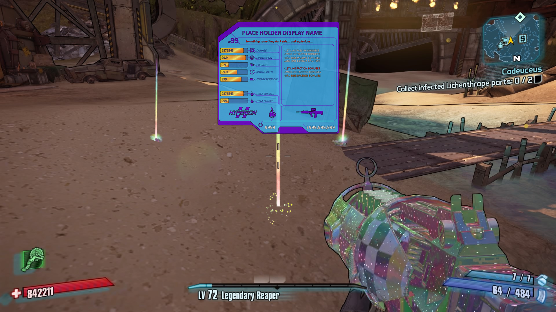
A player would equip a card by inserting it into the card slot on the upgraded ECHO device. Once loaded, the chip will create a physical version of the item, or gun in most cases, that the player can use as expected in the game.
KEY ASPECTS
THE GOLD PINS
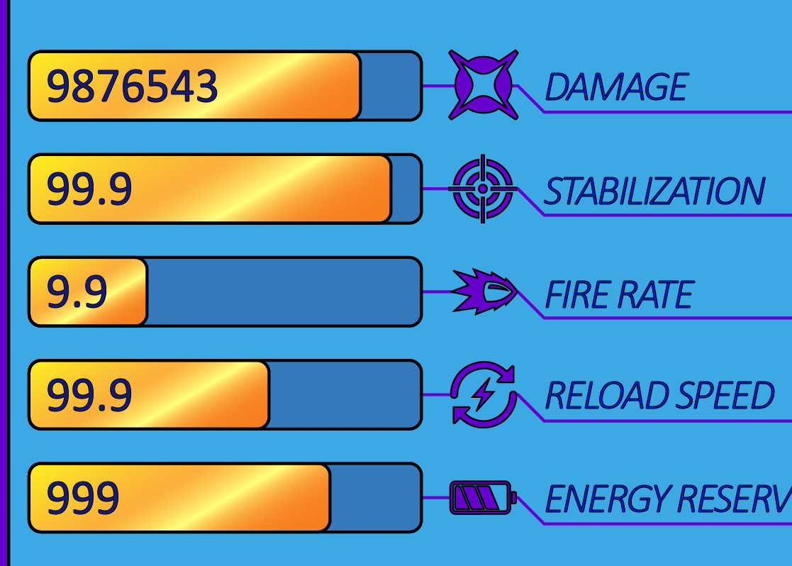
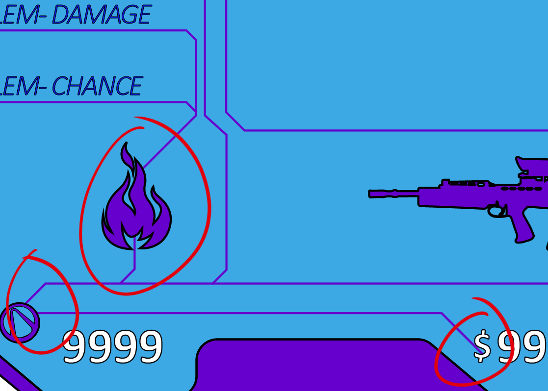
As such, with memory cards, some pins activate specific parts of the memory card and allow it to function when connected. Taking this idea, I incorporated that into my design by making the stats themselves the connector pins, representing each part of the item.
THE CIRCUIT LINES
These lines in the design are a subtle edition that makes a significant addition to the design. These lines connect the data on the item card, from the gold pins to the data discs underneath. However, when the item is equipped, these lines will have a VFX moving glow, signifying the movement of data and energy through the memory card.
THE SPACING
A significant challenge in the design was finding space for all required information and stats. Through research and personal playthroughs of previous Borderlands titles, I discovered that some information is not always present on some items, specifically the elemental stats. Therefore, I incorporated extra space into the design.
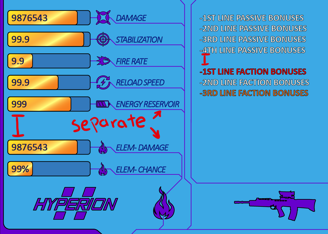
I love the cleanness of the data lines. I think they help move the player's eyes to the stat items efficiently.
-Katie C
DESIGN CONT.
The Nanochip
The original, but smaller.

A secondary part of the item card design was creating a second item card for a new type of ability item. Again, following the theme of memory cards, I rearranged the data to fit and added a spot for a video. This inspiration came from God of War; a small preview of the move will show in the corner when equipping skills. This gives players a better idea of what each ability will do before equipping and finding out.
PROTOTYPE
Comparing Items
I expanded my item card by testing it in a critical area of the game.
There are almost infinite items in the Borderlands games, all with randomly generated stats. So naturally, players will want to keep only the best things, so how would one decide?
The design I decided on was a change from how Borderlands compared items in the past. As a Borderlands player, I struggled with this specific situation.
KEY ASPECTS
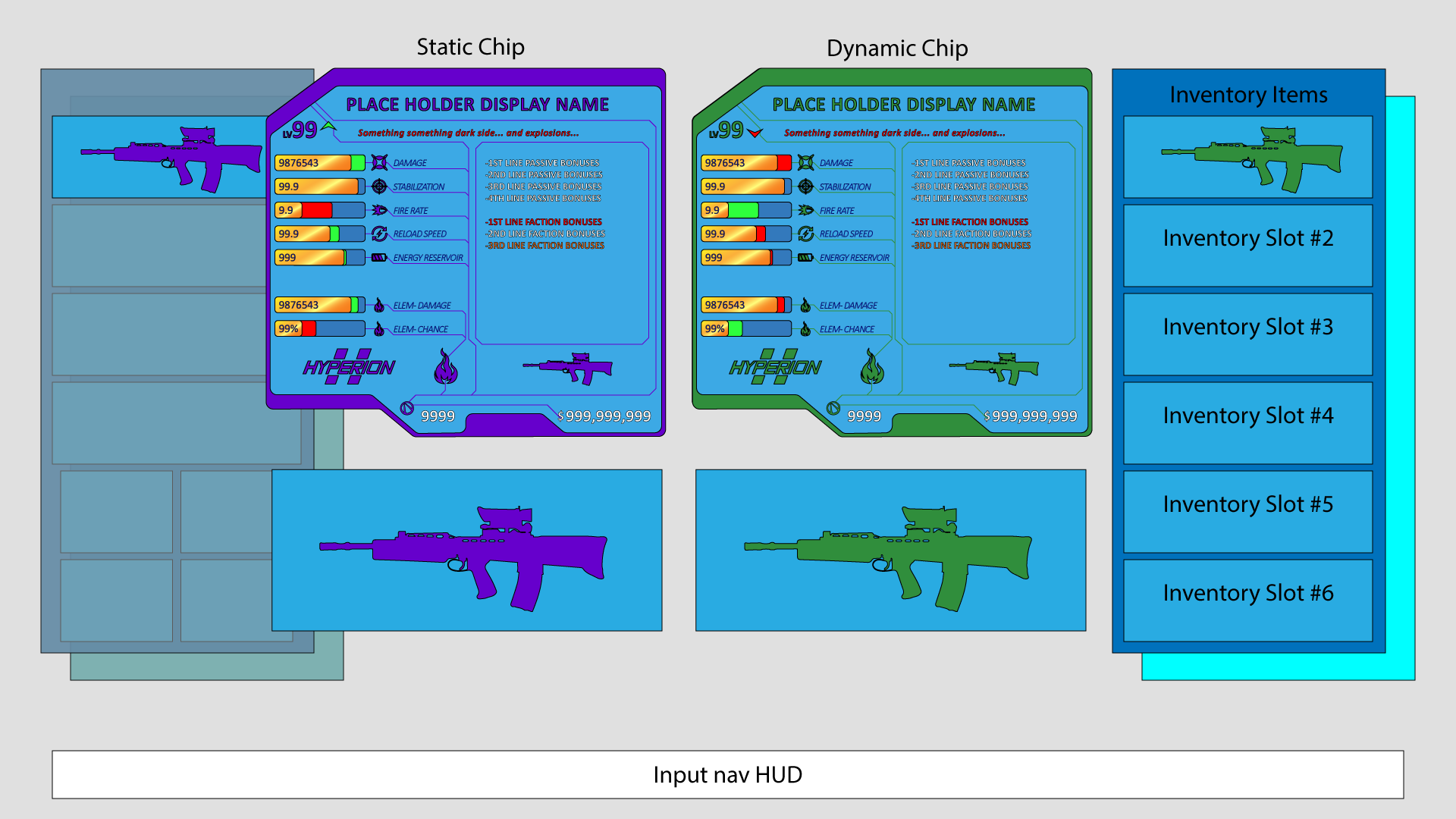
For the compare screen, the player would be interacting with an item select screen (the gun vendor, personal inventory, storage menus, etc.). When highlighting an item, the player would press the compare button, bringing up the compare screen above. There would be a static and dynamic chip. The static chip will be on the left of the screen; the same chip selected when comparing began. The dynamic chip on the right would change based on the selection from the menu on the far right.

THE RED AND THE GREEN
Taking inspiration from Destiny and God of War, I want to show the differences at a glance when an item is being compared. By using red for worse, and green for better, the player can quickly and efficiently see how the new weapon compares to the equipped weapon.
THE GUN MODELS AT THE BOTTOM
I wanted to include the 3D models for each item on this screen to add a more advanced level of immersion. A user can compare all aspects of the item, including the look and feel.

GOAL 2
Catch a Riiiide!
It's where the cars live, now the guns too!
The developers wanted a new way for players to buy and sell items for this goal. I continued with the digital themes in my previous idea and the witty nature of the Borderlands genre. Finally, I settled on a unique way to buy items from the back of a '59 Cadillac.

DESIGN
The idea for this design came from the very illegal activity of buying guns out of the back of cars because it is Borderlands; why not.
I wanted to bring a little level of realism to this buying process. If I was, legally, buying a gun out of the back of a futuristic '59 Cadillac, what experience would I want?

KEY TAKEAWAY
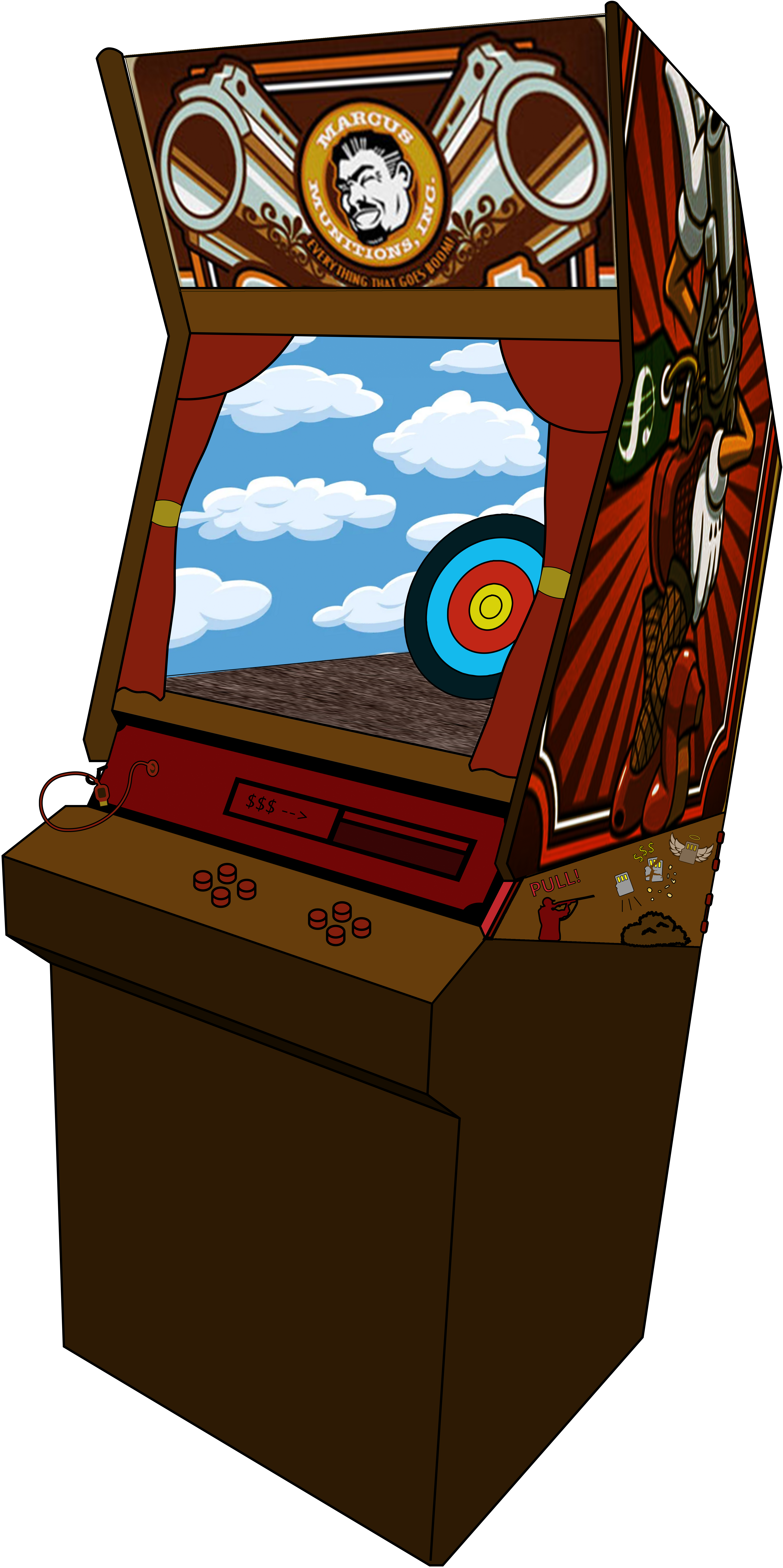
Reflecting on the design now, as much as I loved the '59 Cadillac, the concept doesn't fully connect with the digital theme of the memory cards. Upon further thought, a better-themed idea came to light, inspired by a retro arcade cabinet. The arcade cabinet also fits within the current theming of the Borderlands series of buying items via vending machines.
I wanted to keep the improvements from the Cadillac design and incorporate them into the arcade cabinet.
THE BIG SCREEN
All transactional states will happen on this screen to simplify the vendor process. Users will default to the buying state, where they can view up to 20 possible items to buy, compare with their inventory, and sell unwanted items—only showing vital information to reduce visual clutter. At any time, the user will have the ability to test out a selected item; this will navigate the user to the firing range.


THE FIRING RANGE
A mechanic I wanted to include in my designs was a space in which the player can test out guns/grenades/etc items. Similar to gun arcade cabinets, there will be a "screen" under the big screen that will simulate the use of the selected item.
THE GUTTER
On the side of the cabinet will be a disposal bin, called the gutter, that the player can deconstruct and sell old items through. As the player sells items, the sold items will appear in a list next to the bin. When the player is satisfied with the chosen items to sell they will select the dispose button, confirm the decision, and then collect the cash.

GOAL 4
Not Your Father's Way Of Dodging
Weaponizing evasion tactics, to add a little more flair.
The final part of the design test was creating a new movement mechanic that has yet to be introduced in a Borderlands title, a mechanic that would benefit players in and out of combat. The mechanic I conceived was a dodge roll. A second attack will activate when a player uses the dodge button again during the dodge roll, as shown in the concept below.
Dodge Roll Concept - Kiss of Death

The goal of weaponized dodging was to add something new to a mechanic that has existed in the FPS genre for years. The new mechanic would also allow players more options when maneuvering the expansive maps in Borderlands.